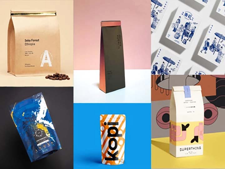
7 Innovative Packaging Ideas to Benefit Your Business
Business thinker Peter Drucker once said that business has two functions – marketing and innovation. This article will merge these two ideas. Packaging is ultimately a marketing function; it is the ultimate marketing message that your customers will see before they buy your product. If you sell in retail stores, your packaging may be a major factor in determining the success of your product.
Today, it pays to be different and to stand out from hundreds of other competing products. Take a look at what your competitors are doing and make sure you have an innovative and unique look. Packaging innovation will get your product noticed, help build your brand, and give your product some personality. Whether you like your product or not will initially be judged by your packaging.
So, how do you create innovative packaging? You can pay a packaging design company thousands of dollars to come up with some ideas, or you can create your own ideas. Here are 7 ideas that promise to inspire packaging innovation for your own products.

1. Make the design the focus of your packaging
Most people think of the product first and the packaging second, but Method Products reverses that equation. They focused on packaging from the beginning – they wanted to create beautiful packaging that you didn’t have to hide in a cupboard. They created a line of premium cleaning products with packaging that you can display in your kitchen or bathroom like a home accessory. Take a stroll through the aisles of Costco or Target and you’ll see that this focus on design really makes Method Products stand out.
2. Add a little something extra to your packaging
Sometimes you can have pretty standard packaging, but just add a little twist to it to stand out, and that’s what Amy’s Kitchen has done with their pasta sauce line. It’s a standard-size jar with a standard color label that really blends in with all the other spaghetti sauce products. What makes them stand out is the paper and gold bow on the lid of the jar. It looks like your grandmother’s packaging in a way that you can’t walk down the pasta sauce aisle without noticing it.
3. Create interesting packaging
Fun packaging is not only for kids – after all, adults like to have fun too. The bright colors and unusual shapes that dominate children’s products can be used for adult products, but often a more subtle approach is better. The wine industry has begun to add more fun to its packaging. Just head to your local liquor store and check out all the fun animals on wine labels these days. We have penguins, kangaroos, frogs, horses, swans, and many more critters that appear on wine labels. We may not be ready for penguin shaped bottles, but colorful penguin labels can add fun and really stand out from the more conservative wine labels.
4. Try the metallic look
Most labels are printed on white or clear materials, but you have many other options to choose from. One look you might consider is the use of metallic foil on the label or package. A well-designed metallic look can be very eye-catching compared to the same design on white, and it’s not really that much more expensive.
5. Let your true colors shine through
Candle-Lite is a giant in the candle industry, with over 160 years of continuous candle making business. Their packaging is nothing special, just candles in a clear jar, but the colors they choose are eye-catching. They use bright colors, often with multiple layers of candles, and let those colors shine with a simple clear jar. A simple label on a white background highlights the colors in the jar. Their candles really stand out from the dozens of other brands on the shelves of my local supermarket.
6. Merging two packaging concepts
Another very competitive industry is the beer industry, where the big players are always looking for a competitive edge. Last year, Anheuser Busch launched a new packaging concept that ended up winning several packaging awards. The concept is so simple that it is surprising that no one has done it before. We all know that beer comes in glass bottles and aluminum cans, and what Anheuser Busch decided to do was to combine these two concepts, and they came up with the aluminum bottle. It’s different, it looks elegant and eye-catching, and it’s 100% recyclable.
7. Focus your packaging on a specific target
Unilever’s Axe range has a very specific target audience – young men between the ages of 18 and 35. So they designed their packaging to appeal to this target. the packaging for Axe body wash looks as easy to fill with motor oil as it does with body wash. It is a thick, molded black plastic container with a sturdy look that appeals directly to this demographic. It is a product that is tailored not only to its specific target market but also to its content and packaging.
The idea of this article is to get you to think more about your packaging. Take one or two of these ideas and think about how you can apply them to your product. You will be more successful if you focus on your packaging and create something unique for your company. Remember, your packaging should not only contain your product, but also your ultimate marketing message to your customers.
Taizy Packaging Machinery is a comprehensive packing solutions provider. We have rich experience in the research, design, manufacturing, and marketing of various packing machines. If you want to start your packaging business, contact us today for professional and excellent guidance.
